 A bar graph is a graphical representation of data. It consists of vertical or horizontal bars that represent data values.
A bar graph can be used to show the relationship between two sets of data, for example, sales and expenses. The height of the bars in the bar graph will tell you how much money was spent on certain things.
Why Use a Chart in the First Place?
Charting data is one of the most powerful ways to make sense of large datasets. It helps you identify patterns and trends from the data, which in turn helps you make more informed decisions.
A line graph is a type of chart that displays the relationship between two different variables by plotting each variable on a separate axis. Line graphs are useful for observing changes over time, such as tracking monthly sales figures or stock prices.
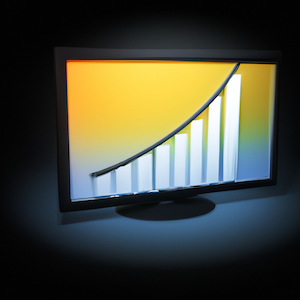
A bar chart is a type of chart that displays categorical data with rectangular bars of different heights or lengths, usually with an accompanying table showing the values underlying each bar. A bar chart is often used to show comparisons between categories by displaying one category as a vertical axis and another category as a horizontal axis.
Setting Up Your Data - General Guidelines for Creating Proper Data with Bar Charts
The bar chart is a very common way to display data. It's very easy to understand, and it's an efficient way to convey a lot of data in a small space.
In order for the data to be clear and easy to read, you need to organize it properly. This means that you need to have the x-axis (usually time or category) on the left side of the chart and the y-axis (usually quantity) on the bottom. The bars should start at zero and go up in order of magnitude so that they can be easily compared.
Create a bar chart in Excel
A bar chart is a chart that displays data as vertical bars of different lengths. It’s one of the most common charts used in business.
To create a bar chart in Excel, you need to:
-
Select the data you want to include in your chart
-
Click on the Insert tab and select the Bar Chart icon
-
Click on the Design tab and select a style for your bar chart
-
Adjust any settings like colors and labels.
What are the Advantages of Using Bar Charts?
Bar charts are used to show the magnitude of data in comparison to other data.
Bar charts are a quick and easy way to display information. They can be used for a wide variety of purposes, such as comparing different groups, showing trends over time, or summarizing categorical data.
A bar chart is a graph that uses bars with lengths proportional to values that they represent. The height of each bar represents the magnitude of the value it represents.
Tips for Adding a Color Palette to Your Chart
The colors you choose for your presentation will have a huge impact on how your data is perceived. Colors have been shown to affect the way people feel and react to information, so it's important to use colors that convey the right tone.
-
A color palette is a group of colors that are related in some way, such as complementary colors or analogous colors. They are often used together in an image or design because they work well together and create a pleasing effect.
-
A color scheme should be appropriate for the subject matter. For example, bright colors might not be best for charts about financial data or dark colors might not be best for charts about sports scores.
-
Colors should contrast with one another so they can be read easily on screen and in print. If you're using more than one text color, use them consistently. The foreground text should be dark while the background is light. The font size of your heading should "stand out" from the body text.