 Data visualization has become an essential skill in today's data-driven world. The ability to transform raw data into meaningful and easily understandable visuals can help you make better decisions, communicate your findings effectively, and tell a compelling story. Microsoft Excel, a widely used spreadsheet application, offers a plethora of charting options to cater to various needs. This beginner's guide to MS Excel charts aims to provide you with a solid foundation in creating and customizing charts, allowing you to harness the power of data visualization.
Understanding Excel Charts
An Excel chart is a graphical representation of data, making it easier to spot trends, patterns, and outliers. By visualizing data, you can identify relationships between variables, understand data distributions, and make sense of large data sets quickly. Excel offers a variety of chart types, including bar, column, line, pie, and scatter, among others. Each chart type is designed to represent specific data structures, and understanding their appropriate use is crucial for effective data visualization.
Selecting the Right Chart Type
To create an effective chart, it is essential to choose the right type based on your data and the insights you wish to convey. Here's a brief overview of some common chart types and their uses:
- Column Charts: Ideal for comparing discrete categories or displaying data changes over time, column charts display vertical bars with lengths proportional to the data values.
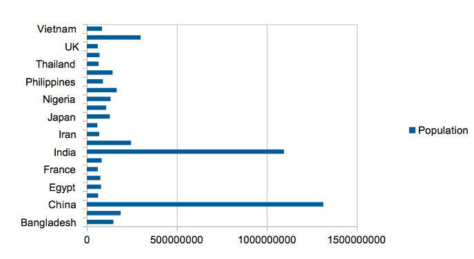
- Bar Charts: Similar to column charts, but with horizontal bars, bar charts are suitable for comparing data across categories, especially when there are long category names or numerous data points.
- Line Charts: Line charts are best for illustrating trends and changes over time, as they connect data points with a continuous line. They are particularly helpful when comparing multiple data series.
- Pie Charts: Used to represent the proportions of a whole, pie charts are suitable for displaying data with few categories. However, they can become difficult to read with too many categories or small differences in values.
- Scatter Plots: Scatter plots help visualize the relationship between two variables, with each data point represented by a dot. They are useful for identifying correlations, outliers, and trends.
Creating Your First Excel Chart
Now that you have a basic understanding of Excel chart types, let's dive into creating your first chart. Follow these simple steps:
-
Organize Your Data: Ensure that your data is well-structured, with rows representing categories and columns representing data series. Include headers for clarity.
-
Select Your Data: Highlight the cells containing the data you want to visualize, including headers.
-
Insert a Chart: Navigate to the 'Insert' tab on the Excel ribbon, and click on the desired chart type from the 'Charts' group. Excel will automatically create a chart based on your selected data.
-
Customize Your Chart: Once your chart is inserted, you can customize various elements like titles, legends, data labels, and axis labels by clicking on the respective elements or using the 'Chart Design' and 'Format' tabs on the ribbon.
-
Apply a Chart Style: To make your chart visually appealing, apply one of the predefined chart styles available in the 'Chart Design' tab or create a custom style using the 'Format' tab.
Tips for Effective Data Visualization
Creating visually appealing and informative charts requires some best practices. Keep the following tips in mind to ensure your charts convey the intended message effectively:
-
Keep It Simple: Avoid overloading your chart with too much information or unnecessary elements. Stick to a single chart type and use a limited number of data series to maintain clarity.
-
Choose Meaningful Colors: Use colors to distinguish between different data series, highlight important data points, or emphasize trends. Avoid random or overly bright colors that can distract from the main message. Opt for a consistent color scheme that is easy on the eyes.
-
Label Your Data: Provide clear and descriptive labels for your chart elements, such as axes, data series, and legends. This helps your audience understand the context of the data being presented.
-
Opt for Readable Fonts: Use simple, legible fonts for all text elements in your chart, including titles, labels, and legends. Ensure that the font size is appropriate and consistent throughout the chart.
-
Emphasize Key Insights: Highlight important data points, trends, or relationships that you want your audience to focus on. You can use techniques like contrasting colors, bold labels, or annotations to draw attention to these insights.
-
Maintain Aspect Ratios: Ensure that your chart is properly scaled to avoid distortion or misinterpretation of data. A poorly scaled chart can lead to misleading conclusions.
-
Test Your Chart: Before finalizing your chart, share it with colleagues or friends to gather feedback. This can help you identify areas for improvement and ensure that your chart effectively communicates the intended message.
Conclusion
Data visualization is a powerful tool that can help you make sense of complex data sets and communicate your findings to others. MS Excel provides a wide range of charting options to create visually appealing and informative charts. By following the tips and best practices outlined in this beginner's guide, you'll be well on your way to mastering the art of data visualization with Excel charts. As you gain experience, don't hesitate to explore more advanced charting techniques and customization options to take your data visualization skills to the next level.