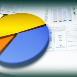
 A pie chart is a circular chart divided into sectors, or slices, which represent the relative magnitudes of a particular set of data.
Pie charts are used in business to illustrate the proportion of each element in a whole. They are also used when you want to show what proportion one group or thing is out of another group or thing.
Tips for using a pie chart:
-
Use different colors for different sectors
-
Label the sectors with the appropriate information
-
Make sure that all sectors have enough slices
Creating a pie chart is not as hard as it seems. All you need to do is make sure that the data is correct and the pie chart will automatically be generated.
Why We Use Pie Charts & What Makes a Good One?
Pie charts are a great way to visualize data. They are easy to read and very informative.
The most important thing when making a pie chart is to make sure the percentages add up to 100%. If they don't, then you need to reorganize your data so that they do.
Pie charts should be used only when you have more than one category of data. They cannot be used for one category of information.
Pie Charts in Spreadsheets
A pie chart is a diagram used to represent parts of a whole. Pie charts are often used when there are three or fewer categories of data. Pie charts are also helpful for comparing proportions of different parts (e.g., the percentages of ingredients in a recipe).
Pie charts should not be used when there is a large number of values and the differences between them are small. If you have more than six categories, consider using another type of chart such as a bar graph or line graph instead.
What Types of Pie Charts Are Available?
Pie charts are a type of graph that is used to show a proportion of a whole. They are used in many different ways, such as comparing the size of different sectors in an economy, or showing the proportion of people who support a particular policy.
A pie chart can be drawn in two ways: either by cutting the whole into slices and then drawing each slice as a circular sector, or by drawing the sectors from the center outward.
Pie charts can be drawn for both two-dimensional and three-dimensional data.
Using Pie Charts
Pie charts are a great way to visualize numerical data. They allow you to quickly see the relative size of different parts of a whole. They can be used in Excel spreadsheets, PowerPoint presentations, and other software applications.
There are many different ways to create pie charts in Excel, but they all have one thing in common: they need data that is in percentages or fractions. For example, if you want to create a pie chart showing the percentage of your company's revenue from various sources, then your data should be numbers such as "5% from product X," "10% from product Y," etc.
Conclusion
Pie charts are a great way to display data in an easy-to-understand format. They are also one of the most popular chart types.
A pie chart is a circular chart divided into sectors, with each sector representing a different category of data. The circle is typically split into slices that represent the relative proportion of each category.
There are many advantages to using pie charts such as they can be easily understood by people who don't know how to read graphs and they can be used for any type of data, not just numbers and percentages. They also do not require as much space on a page as other charts or graphs would need, which means that you can use them for smaller datasets or for more complex data sets where you want to show more detail than just the total sum.