 Google Sheets and Excel are spreadsheet programs that are often used by businesses to track their data. The two programs have some similarities, but also some differences.
Spreadsheets are an essential tool for businesses. Google Sheets and Excel are two popular programs that help users keep track of their data. One of the major differences is that Google Sheets is a cloud-based program, meaning all your files will be stored in the cloud. Microsoft Excel, on the other hand, stores all your files on your computer's hard drive. If you have a lot of files, this can make it difficult to find the ones you need.
Google Sheets has an Insert Chart option built in that will show the Chart editor. From the editor a chart can be selected from the Suggested options, or Line, Area, Column, Bar, Pie, Scatter, Map or a range of Other types of chart.
Google Charts is a separate online based API system that allows the creation of a chart in web pages by simple coding.
Google Sheets is a powerful tool that can be used for many different types of tasks. It's not just a spreadsheet application but also a fully-fledged database and it can be used for many tasks such as tracking inventory, managing projects, and much more.
Charts are a great way to visualize data in your workbooks. They help to tell a story, and can make it easier to understand the information that is being presented.
Types of Charts within Google Sheets
The types of charts in Google Sheets include line graphs, bar graphs, and pie charts.
Line Graphs: Line graphs are often used to display trends over time. It is the most common type of chart in Google Sheets.
Bar Graphs: Bar graphs are used to show comparisons between two or more items.
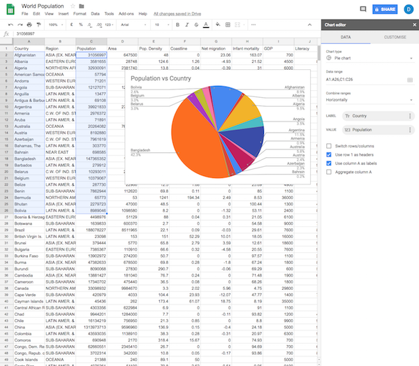
Pie Charts: Pie charts are used when you want to compare parts of a whole or show how much each part contributes to the whole.