Open Office Charts are a useful way of displaying data visually from a spreadsheet.
The Open Office spreadsheet program is called Calc and has a char...
Google Sheets and Excel are spreadsheet programs that are often used by businesses to track their data. The two programs have some similarities, but a...
Online Chart Makers can be used to produce free charts for inclusion in reports and presentations, or for general data analysis.
There is the benefit...
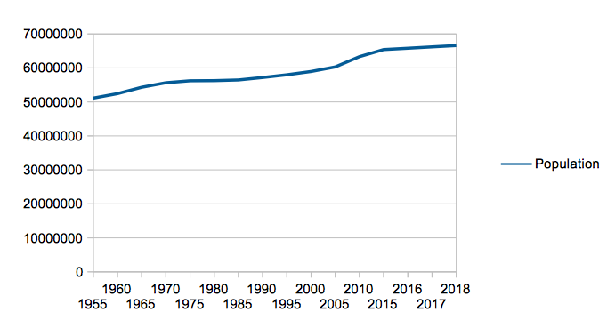
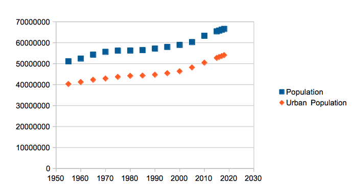
A line chart is a type of chart that displays information as a series of data points called "markers" connected by straight lines.
Line charts are of...
What is a Spreadsheet Chart?
A spreadsheet is a type of computer program that is designed to assist with mathematical calculations and other tasks in...
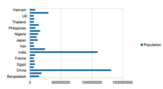
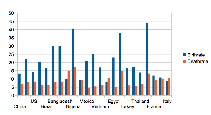
A bar graph is a graphical representation of data. It consists of vertical or horizontal bars that represent data values.
A bar graph can be used to ...
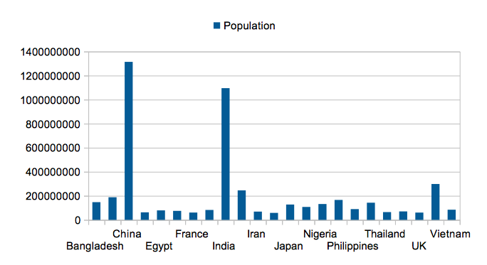
A column chart is a type of chart that displays information in columns. It is used to compare different categories of data.
The column chart is used ...
Data visualization has become an essential skill in today's data-driven world. The ability to transform raw data into meaningful and easily understand...
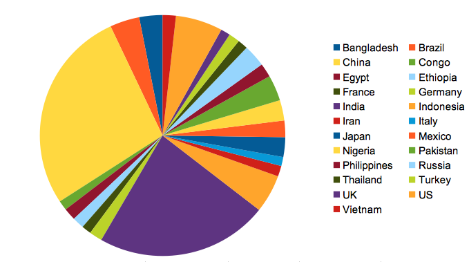
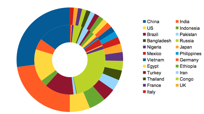
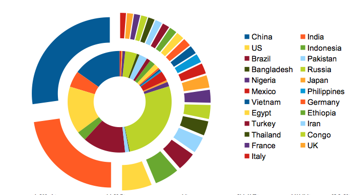
A pie chart is a circular chart divided into sectors, or slices, which represent the relative magnitudes of a particular set of data.
Pie charts are ...
Charts are one of the most useful tools in Excel. They can be used to present various data quickly and easily. Charts are also a great way to visually...
Creating charts in a spreadsheet is a great way to visualize data. You can create simple column or bar charts, box plots, histograms, pie charts and s...
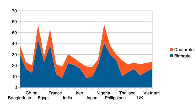
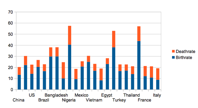
Area charts are a type of chart that use area to represent data. The data is represented by lines for each data set, with the differences highlighted ...
In the world of business and data, charts are a critical tool for conveying information quickly and effectively. The right chart can take a dry spread...
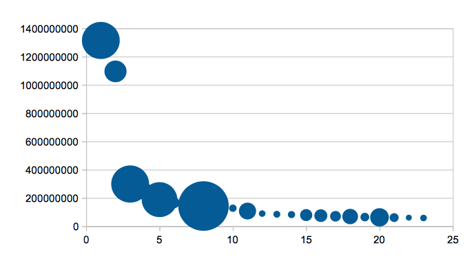
A scatter chart is a type of chart that displays the relationship between two variables. It's a good way to visualize correlations and patterns in you...
Microsoft Excel, a powerful and versatile spreadsheet application, offers a wealth of charting options that cater to diverse data visualization needs....